Design Principles in Action
As a digital marketing agency, we have to handle graphic design a lot in our daily life. We make content for numerous platforms for over 30 clients at a time. For those who don't get to work with design principles everyday, it may be hard to understand why you like some designs you see more than others. Let's take a look at basic design principles that make designs more pleasing to look at.
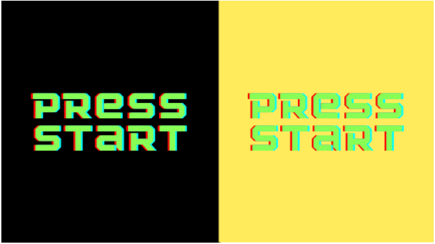
Emphasis
The first rule is called emphasis. As you would imagine from the name, emphasis involves making some element of the design stick out more than others. More important text or images should be emphasised so that viewers' eyes are drawn their first. Be sure to emphasize the main message or idea rather than random bits of text. In many cases, people will look at whatever is emphasized first. It should make sense out of the context of what is around it. Take a look at these two examples to see what we mean.

Balance and Alignment
Next up we have balance and alignment. The way elements are laid out on a design should be balanced. One area should not be filled to the brim with elements while another area is blank. There are different ways to balance a design. Symmetrical balance involves elements of similar weights balancing each other. Usually, these designs are balanced around an obvious line such as the center line. Asymmetrical balance uses elements of different weights. Typically, asymmetrical balancing occurs along an odd line, though it can use obvious lines as well. On the left we have a symmetrical balance, and on the right we have an asymmetric balance.

Contrast
Contrast is hugely important in designs. If you can't read the text because there isn't enough contrast, there's a problem. Generally speaking, most digital marketing agencies don't struggle with this design principle. It's almost inherently known. There are some colors that are harder to see/read when paired with other colors. That being said, if you go on social media and do some hunting, you'll probably find some posts that have questionable contrast to say the least. For the best contrast, try to avoid overlaying strong patterns with text. On the left we see good contrast, and on the right we have an example of contrast so bad that it hurts to look at.
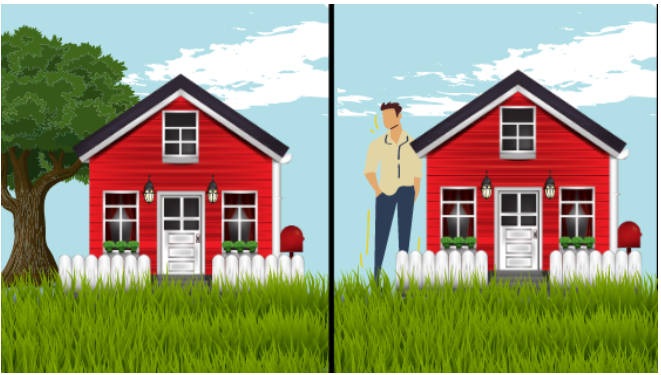
Proportion
After contrast we have proportion. As you might guess, this design principle is related to the size of elements in relation to other elements. In graphic design, the larger an element, the more important it is. However, when using multiple elements or images together, it is also wise to make sure the proportions between them are realistic. If you're trying to make a house landscape, don't make the tree so large it's out of frame while the house is small. Think of proportions in terms of humans; if the head is too big for the neck, it's not proportionate. Likewise, if the torso and head are equal with extremely short legs, that person is not ideally proportioned. On the left we have a nice proportion, but on the right we see that the proportions are very off. The man should not be taller than the house.
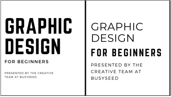
Hierarchy
Hierarchy is one of the design principles used most often in social media marketing. It's similar to emphasis because the goal is to guid the eye to what is most important. Hierarchy can be seen most clearly in titles, subtitles, headlines, and body text. In addition to guiding the eye and highlighting what's most important, it can be used to group chunks of text together as one unit. In this article, notice how the title is the largest font, followed by the subtitle, and then each section is divided into a bold and large heading followed by the body text. In graphic design, we follow the same idea. The main message will be largest, and all other text will be prioritized by changing the size. On the left we see a good example of hierarchy. On the right, all the fonts are similar in size, and the second line is more prominent than the class title. This is an example of bad hierarchy.
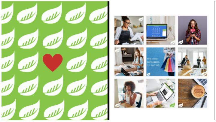
Repetition
Repetition in design reinforces an idea. It involves using similar elements or formats to unify designs within themselves and even between each other. Repetition helps viewers recognize something as belonging to your brand. In social media marketing, we put client logos on almost every piece of creative we post. This is a repeated element that unifies their account page and shows that each individual piece is part of a larger branding choice. Colors, fonts, elements, imagery, layouts, and more can all be used to achieve repetition. On the left you'll see an example of repetition within a design, and on the right you'll see an image of our BusySeed instagram to show how repetition can be achieved between designs.
Negative (White) Space
Lastly, let's talk about negative space. In many good designs, you'll notice some negative space. This is also called empty space or white space. Any digital marketing agency will tell you that cramming designs with things to look at puts you on a fast track to overwhelming viewers. Don't be afraid to utilize negative space. This empty area gives important text and elements room to breathe and can help a design avoid feeling cluttered. Websites, social media posts, ads, etc. all benefit from at least some negative space. It provides padding to the design and can actually be used to draw the eye to a focal point. Photographers have mastered the art of negative space and can create incredible shots that guide the eye to look exactly where you're supposed to look. You'll notice in these images that the left hand design is overwhelmingly full whereas the version on the right is much more welcoming and pleasant. This is all thanks to negative space.

There are many more design principles that digital and social media marketing agencies will look at when creating content. You can read about more principles here: https://bsyl.ink/PrinciplesOfDesign. Graphic designers spend years in school mastering all of them. If you want to create content that is not easy to forget, we suggest working with a digital marketing agency! We can help you nail down your brand and start putting out content that will get you the results you want. BusySeed has worked with over 300 clients so we have plenty of experience under our belt. If you're ready to get started, call us at (888) 353-1484! We hope to hear from you soon!

About the Author
Omar Jenblat is a powerhouse in the digital marketing landscape, renowned as the Founder and CEO of BusySeed, an award-winning agency that has scaled over $1B revenue for 550+ businesses through high-performance growth strategies. With a technical foundation in computer engineering, Jenblat bridges the gap between complex data analytics and creative marketing, specializing in aggressive revenue scaling, SEO, and multi-channel lead generation. As a member of the Forbes Agency Council, The Org, and a visionary entrepreneur behind ventures like LeadChaser.ai, The Honest Agency, and Zeed Agency, he has established a global footprint by leveraging a "human-led, AI-assisted" philosophy to drive measurable ROI for major brands and startups alike. His expertise is characterized by a focus on digital automation and performance-driven results, consistently positioning his firms at the forefront of the evolving technological landscape.